This week, in my new book, I’m learning about color.
And how seductive it can be. Ever thought of color as seductive in a photograph? I hadn’t. But it most definitely can be. And I have realized that I am enamored with color. Lots and lots of color.
Hello. My name is Stefanie. And I am a color freak.


Back to my book.
The author begs the question, “Have you tried your image in black and white?”


He goes on to explain that every element in an image is significant – it has meaning whether the photographer intended it or not – and this includes the inclusion or exclusion of color.


And that if color doesn’t add to the overall image, and what it conveys, then it detracts.
Ouch.


So the author gives his readers the following exercise.
Collect six of your favorite photos. Or nine if you’re like me and can’t choose only six.
And convert them from color to black and white. For mine, I basically just desaturated them completely. I upped the exposure where I needed to, but that was about it.


And then he has you ask yourself the following questions:
What changes when the color is excluded from the photo?
How is my eye drawn differently?
How do I respond differently?
Is the color helping the photo? Or simply propping it up?
And are the components (lines, tones, moment, light, etc.) powerful on their own without color?


Personally, I loved this exercise, since I rarely ever convert my pictures to black and white (see earlier admission about being a color freak).
I purposefully chose some pictures I was sure I wouldn’t like in black and white. And some I thought I’d love.


And I was surprised. Some I really liked that I wasn’t expecting to like. And some I didn’t.
I was also surprised by how much “more” I could see about the image with the color excluded.


What do y’all think? Any of these stand out as better in black and white? Or color?
And if you decide to do this exercise on your own, I’d love to hear if you gleaned anything from it.
Happy desaturating!
it´s a very nice experience! the most pics are beautiful in bw too in a different way. some i like even more in bw 🙂
EVERY single one~ GORGEOUS!!! XO
I work in black and white film photography, where I play with all of the little things one by one in the dark room with an enlarger.
I find that detail and pattern are much more noticeable in Black and White, giving pictures much more of a graphic appeal than color.
The only critique I have of your pictures is regarding contrast. Contrast is to black and white what the color palette is to color photography- it gets you depth, tone and color. a rule of thumb you can follow is that within every photo you should have the darkest black, and the lightest light. This prevents a photo from either looking washed out or too dark. You capture this beautifully in the picture of the bridge, but have a lot more room to play with contrast in the picture of Poppy by the fence. Just something to think about!
Gorgeous! Every single one!
Love the B&W conversions of Tallula by the fountain and laying on the chair. Lovely.
I’m no photographer or artist… but I like the closeup of Poppy in b&w and the one of Tallulah laying down in b&w. For some reason, without the color I’m drawn to Poppy’s eyes and to Tallulah’s face much more than in the color. The others I’d go for the color… but then again I usually like the color more 🙂 They are all beautiful photos!
I was going to say the same thing as Angela – maybe its the eye of those of us who are not photographers!
Poppy’s eyes really stand out in the B&W. I lparticularly ove the bridge in color and Tallulah with the fountain in color.
I was the picture of Tallula at the fountain in b/w is stunning….. Love it! Thanks for sharing. I love visiting your blog
I feel like in the b&w photos, the details really pop, and I am drawn straight to the eyes and faces – the most important parts! But in the color photos my focus roams all through the photo.
What a great exercise! I love how you capture color so I’m usually going to opt for color. I like black and white for texture and landscape since it doesn’t mess up skin tone. Your bridge photo is magical with or without color!
The bridge photo is gorgeous in B&W. But the others – color all the way. The subjects (your kids) don’t seem to stand out as well in the B&W as they do in the color photos. BUT – this is strictly my, non-pro-photographer, opinion…
Fabulous post about one of my favorite subjects, guess that’s because I’m a color person too.
I took an online class last year about finding your style in photography and my style has to do
with color, in that I compose with color. Love this exercise and though I adore the use of color,
I’m trying to think more about black and white when I edit an image. Especially in a portrait you
can see the mood or personality of a person and aren’t distracted by the color.
To me the bridge photo is stunning in black and white, it’s timeless. My other faves are of the horse and the first and last ones of your girls.
hugs,
Gail
I like the one with your oldest daughter in color as well as the boat one. But the others I like just as well or better in b&w. Such good pics!
I’m not a photographer, but I love viewing pictures! 🙂 The ones I like better in B&W are the ones of Lula and the fountain and the one of your horse. I think the horse one is my absolute favorite out of them all…
Hello, my name is Jill… I too am a colour freak!! I so love colour over B&W.
I know, I’m no help!!
Just call me Kim, the color freak!
Ok – I’m for sure not a photographer, but here’s what I see in a few of them.
Victoria-I like the color. I see your beautiful subject (especially the eyes) in the color, and in the B&W your subject blends into the background just a bit and you lose a bit of her eyes.
Bridge picture – Love them both!
Tallula by the fountain – I like the color version. It’s very clear that she is the subject in the color one and in the B&W I have to look a bit to find the subject.
Tallula laying down – B&W for sure. In the color one, my eye stays focused on the flower in her hair. In the B&W I see a precious little child totally relaxed in the moment. It’s a very calm and peaceful picture and love her little hand there.
Poppy (2nd one). This is for sure about her eyes. I am totally drawn to her eyes in both pictures, but maybe without the color a tiny bit more?
All wonderful pictures!
I was shocked that I loved theone of the horse in B&W. I went from focusing on the hair over his (her?) eye in the color, to focusing on the eye in the b&w.
Same with the last one of Tallulah lying down. In the color, my eye first went to the red flower in her hair. In the B&W, it went to her eyes.
Keep learning! We like to benefit by seeing pretty pictures!!! 🙂
hey, stef! fun exercise. i agree with erin…and wonder how using a B&W action would look compared to just desaturating?
i think in so many of your photos the color adds to the photo because of the mood of the subject!
Well, I might be a dissenting vote but here goes…Victoria in color. It draws you into her beautiful eyes. Can’t find that in the black & white. The horse in color~just seems like you can almost touch her. Poppy in pink…gotta be color…I love how her outfit & hair bow draw out her perfecting lips, and Lula lying down…b&w. Beautiful, everyone of them.
I normally LOVE B&W, but not with any of these. I simply felt like the colors…made me feel THERE, and I love that intimate feeling when I look at photos. 🙂
Totally fascinating : )
I love them both.
Black and White and color.
I go through phases.
Your kids are just so stinkin’ cute.
I personally think that color makes each picture come to life! I do like some b/w photography, but, to say that I prefer any of your shots in b/w over color…not so much. I LOVE color! You’re not the only color freak around. 🙂
First- I LOVE every single one of these. I can see why you like color- all of your color images are spot on perfect. The tones are just right to draw the viewer in to the exact spot they should be- there isn’t anything distracting about them. Like I said- Perfect! However- I do love the black & whites. In your case I think that in some the black & white shifts the focus from one spot to another- where with the color- it was that color that made the focal point obvious. What I found interesting was like in that last one- in color my eye automatically goes to her sweet face & that is all I am really seeing- but with the absence of color I start to notice everything else too like the details of her headband & the texture of the chair. What I find most interesting about this exercise & your images is that I usually use black & white to get rid of the distraction in my images which is usually the colors & help draw the viewer in deeper to my focus. I use it to fade out the other details. The opposite was the case here- while I am drawn to the perfect spot in your color images, it was the black & whites where I started to see everything else. Very interesting. I’m thinking I need to try this exercise myself.
I too like color, but am a novice in photography, especially digital. I like both photos of your eldest. In the second set of photos, I like the color one. The b & w in that one actually loses details (to me). I like both ones of the bridge.
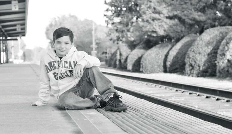
In the next one of your boy and daughter, neither the color or b & w seemed quite right. My first thought when I saw that one was to b & w the trees, street and river, but leave the children in color.
The fountain one-definitely the color!
From a novice color freak 🙂
I personally love a black and white photo… BUT I’ve always LOVED your photos. You are a self confessed colour freak – and it shows in every single photo you take. You have a beautiful knack of capturing colour.
The only one I really liked in black and white, was the river/bridge photo – the rest – the colour is what makes your photos.
I think black and white is fantastic, when the colour in the photo isn’t very special… which your colour always is!!!